
Cinnamon Spicy Nightlife
cinnamon
Brand concept development, experiential, and promotional designs for this red hot night club.


the design process that caused me to push each of my five senses to the limit:
This design solution called for an intense journey of the senses, in all stages of brand development. CINNAMON presented the fascinating challenge of translating human experience into a visual graphic language. In order for my creative vision to reach its full potential, I had to immerse myself in the experience I was attempting to convey. Inundating each of my five senses- to extreme levels- was the only way for me to breath fire and life into what CINNAMON deserved to be.
While concepting and creating CINNAMON, I forced myself to endure the burning sweet & spicy tingle of hot Fireball candies, until I had tears in my eyes and could barely stand the heat! I made sure to brainstorm CINNAMON while my mouth was on fire. I only wrote with a big fat red marker all day every day, and chewed hot Big Red Gum every day, for the whole month while designing this. I listened to salsa, neo-flamenco and electronic latin dance music- exclusively- while working on this case. I endured deafening sound systems and the overwhelming aroma of alcohol in the air of nightclubs while working on my laptop and sketching at the bar.
Shown above and nicknamed the "Volcano", CINNAMON's grand opening invitations emit the strong, red hot scent of the brand- due to the cinnamon chewing gum and fireball candies inside them. Red LED light-up rings and lapel pins- also in the Volcano- allow for a sparkling, living brand-element on the dance floor. The user of the brand becomes the brand.
CINNAMON is: giving in to the compulsion to dance, its the rush of letting go, of getting lost in the music; getting caught up in the heat of the moment.
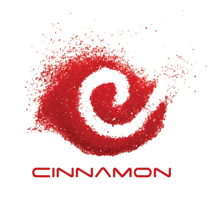
The CINNAMON logo was created by scattering red baking sugar-sprinkles on a scanner, and by making a swirl shape with my finger. Touch and movement. "Motion" was also a important component of the brand; the logo demonstrates this by the means of its creation. The red-attire dress-code allows attendees to unknowingly reinforce the brand to each other, just by being there and having fun. At the same time, when everyone is dressed in the same color, everyone gets to feel the sense of belonging. After all, how often does one feel like part of a club at a night "club"?